
We strive to create a website from the user’s perspective
At DP-mobile, we create websites from the user’s perspective and strive to create designs that are as easy to use as possible.
What “ease of use” means to users is
- Ease of reaching the information they want (ease of finding it)
- Ease of viewing the screen
- Ease of operation
When creating a website, we base our suggestions on these aspects.
No monthly running costs required! A safe service with low prices and complete purchase
In order to make it easier for us to support our customers’ mobile businesses,
we offer low-cost, outright purchases for production.
There are often website production companies that offer “0 yen initial costs! *Server fees are 10,000 yen per month,”
but if you plan to operate for more than a year,
purchasing can reduce costs.
We also provide thorough after-sales support, so if you are unsure about using the site, please feel free to contact us even after production.
*Prices start at 100,000 yen and vary depending on the site volume, so please contact us directly for details.
*Estimates are free
Website creation with speed in mind
We are creating websites with a focus on speed.
Google is currently placing importance on the speed at which sites display, and encourages speed.
DP Mobile has also created sites that are compatible with Google’s “AMP” project, which aims to speed up mobile sites.
*”AMP”: Accelerated Mobile Pages
Although the “AMP” project no longer exists, we are making use of that know-how to create sites that are even more “mobile-specific” than “mobile-friendly,” and that inherit the advantage of being preferred by Google’s algorithms.
PWA
PWA is an abbreviation for Progressive Web App, which is a website that behaves like an app.
It’s one of the projects that Google is focusing on, where websites provide an app-like experience rather than a replacement for apps.
It will be able to cache content locally and send push notifications.
Responsive web design
It is a website design that adapts to the user’s display environment with a single URL (html).
In other words, it is a way of creating a website where a single piece of html changes and adapts to a layout that is easy to view on a computer for people viewing on a computer, and a layout that is easy to view on a smartphone for people viewing on a smartphone.
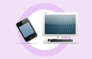
Until a few years ago, it was necessary to prepare two separate websites, one for PCs and one for smartphones (cell phones), but with responsive web design, you can handle both with just one.
This simplifies the site structure and has a positive effect on Google’s algorithms, and a so-called “mobile friendly” website is one that has been created with responsive web design.
Most websites are now responsive, so if you are creating a website from now on, you will want to make sure it is at the very least “responsive.”
At DP Mobile we can handle both production using html and WP (WordPress).